
Picture this…
Making visual craft accessible to everyone.
COmpany
IBM
Partners
1 Project Manager(s)
2 Developer(s)
Platform
Desktop
Scope
Research
Product Design
Context
a toolbox with a single tool.
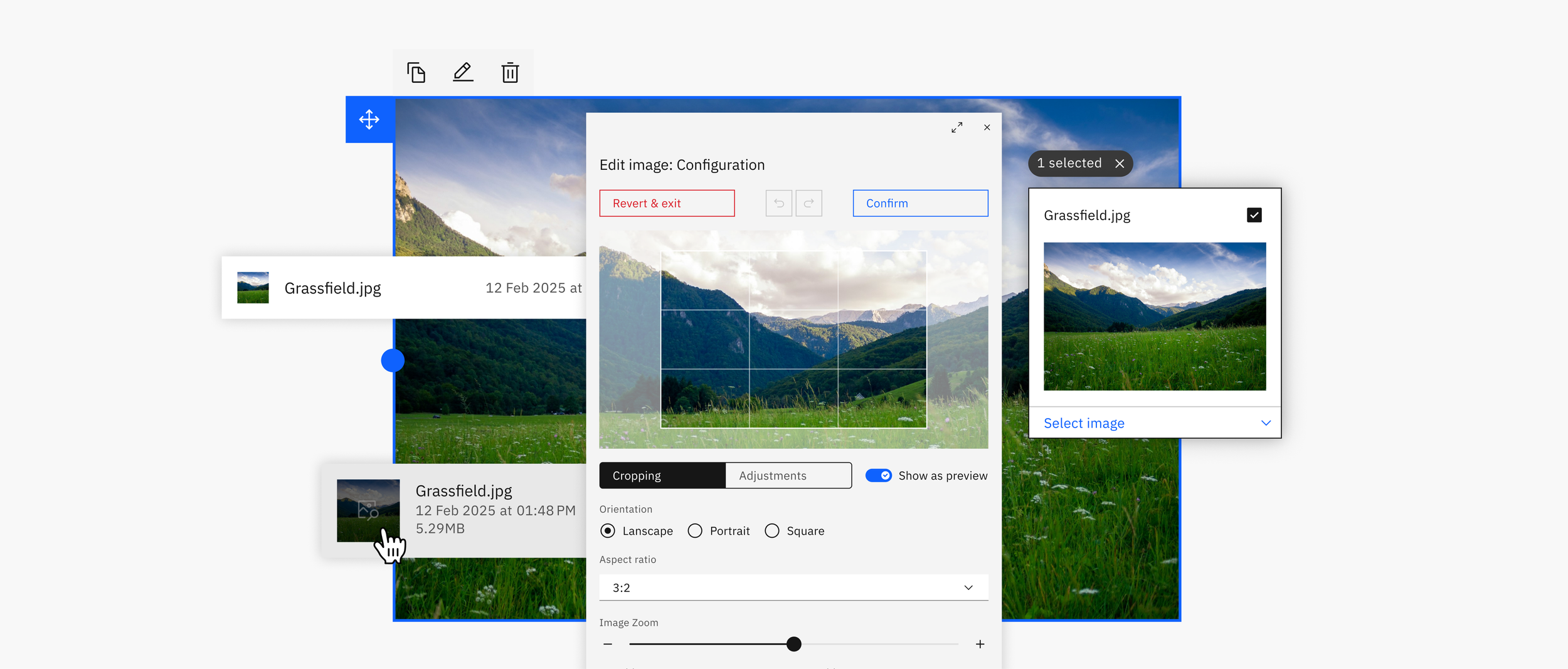
The image widget is one of many modular tools used by Publisher, IBM’s proprietary site builder. Its function is to store images in an asset manager for use on-site. Because the widget lacked many features found in comparable tools, it created friction across common workflows. To resolve this, I broadened available image sourcing options, simplified key workflows and redesigned its components leveraging the Carbon Design System. This required balancing the added utility and complexity with the needs of Publisher’s primary audience: non-technical users.
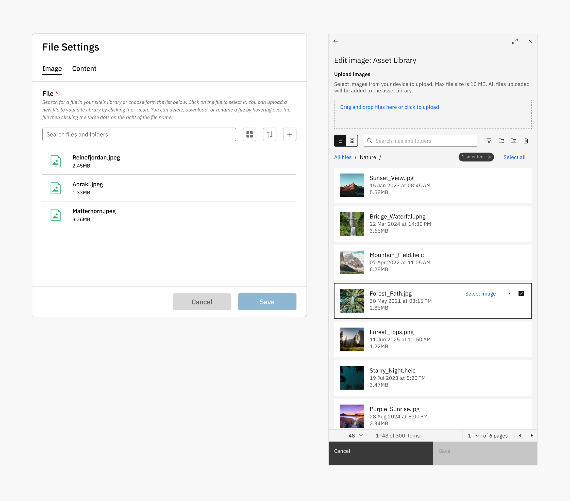
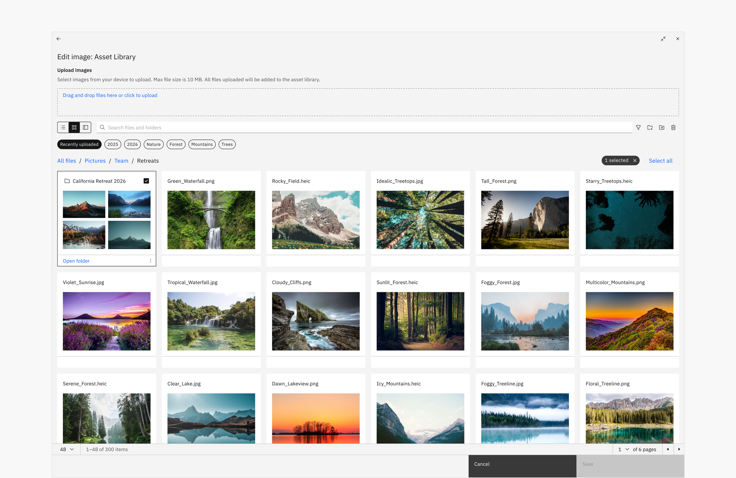
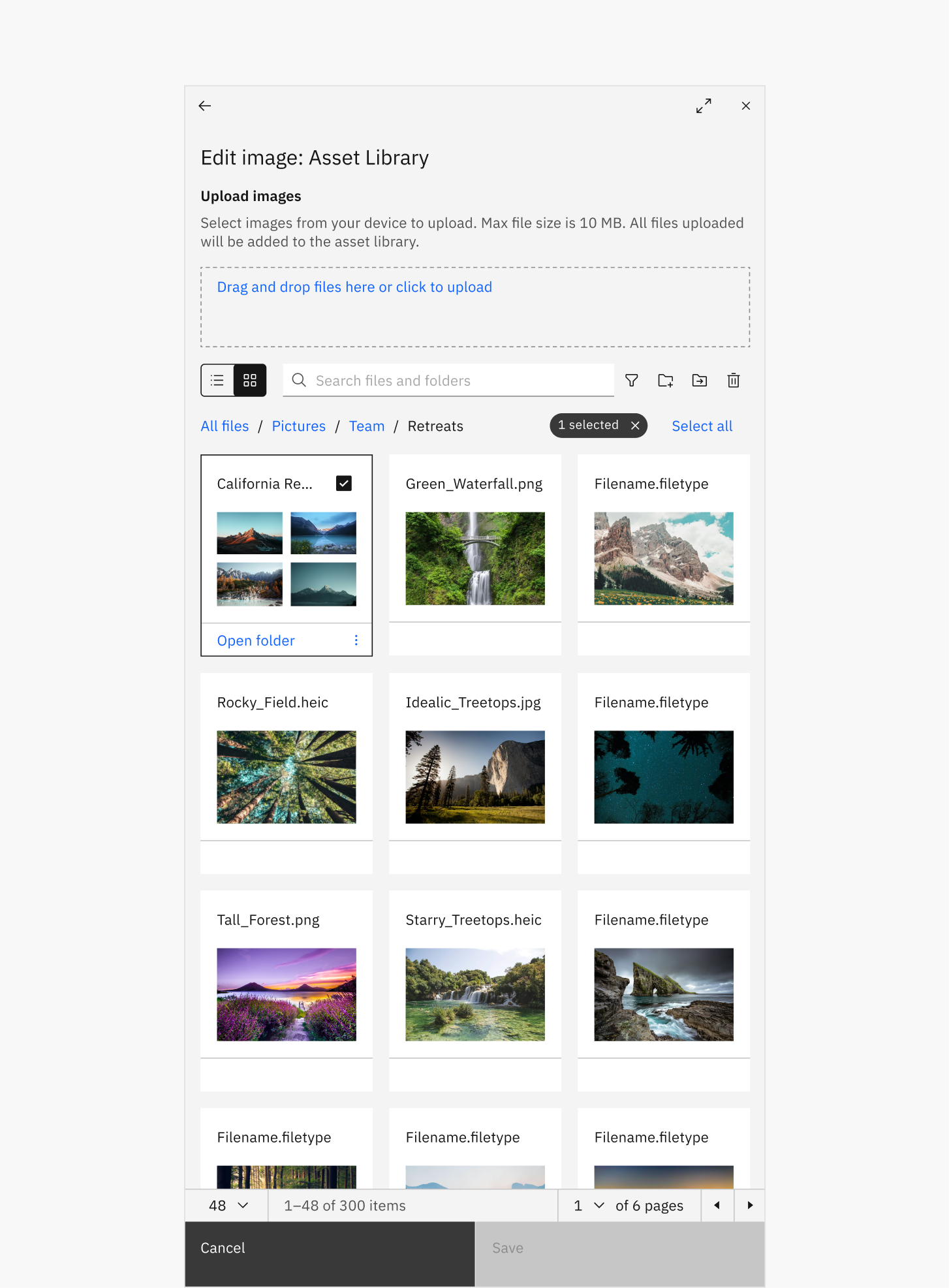
Before and after the asset library redesign with added features including folder organization & breadcrumbs, pagination, full-screen mode and image previews.
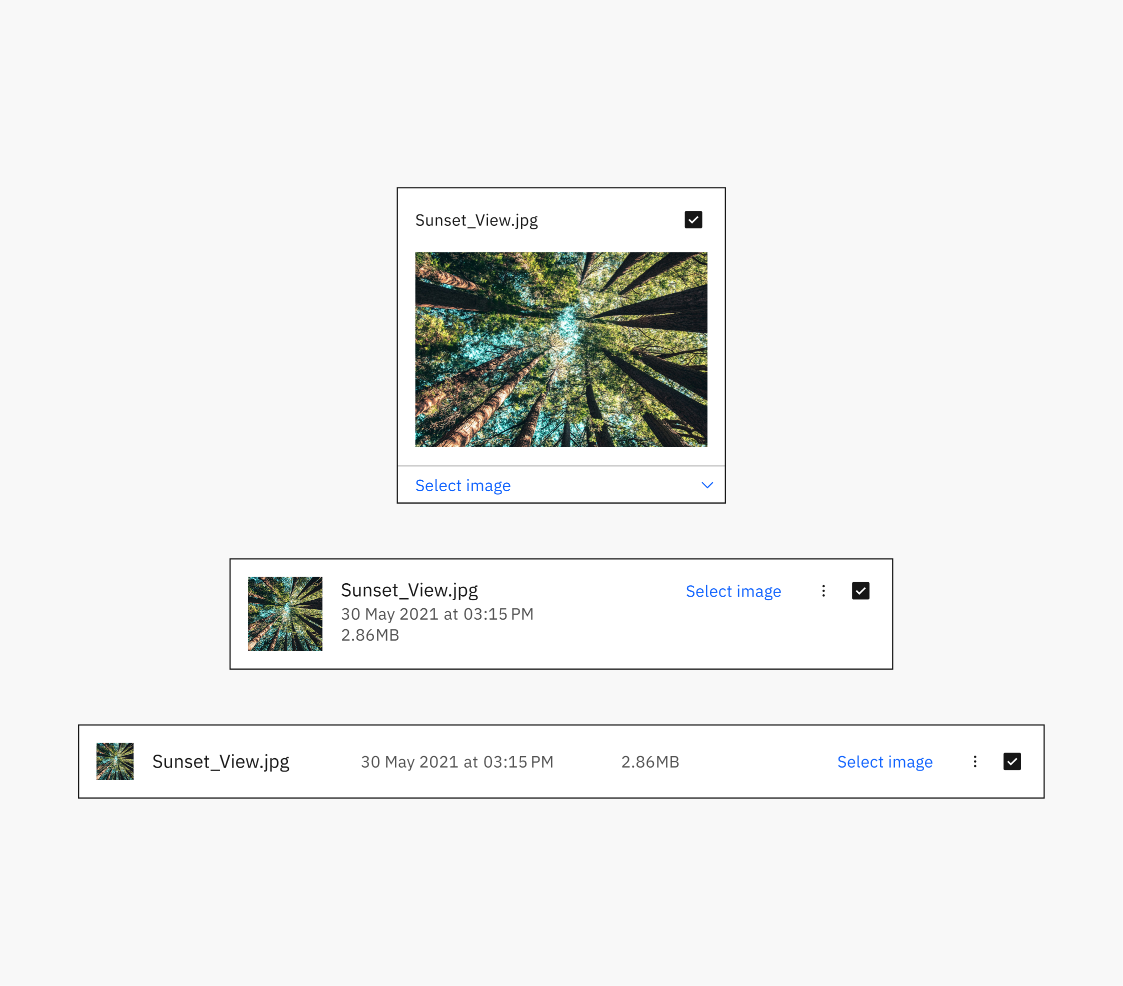
Redesigned Image Card with variants: Grid (Fluid), Row (Expressive) and Row (Productive).
Problem
Achieving a high-quality visual experience required technical know-how.
Not only did Publisher’s image widget lack features of comparable tools, it required non-technical users to quality control images to maintain their site quality. This created friction in everyday workflows, contributed to user dissatisfaction and negatively impacted Publisher’s Net Promoter Score (NPS).
Solution
Make utilizing the right image quick and intuitive.
Publisher's existing upload workflow could produce quality results, but only when users had the knowledge or guidance to select appropriate images. The opportunity was to introduce sourcing options and tools that reduced the technical knowledge required while maintaining quality. The objectives spawned from this are as follows:
Simplify existing workflows without reducing familiarity for long term users.
Add image sourcing options that offer a variety of control and automation to better support non-technical users.
Expand customization tools to reduce screen switching and, subsequently, cognitive load.
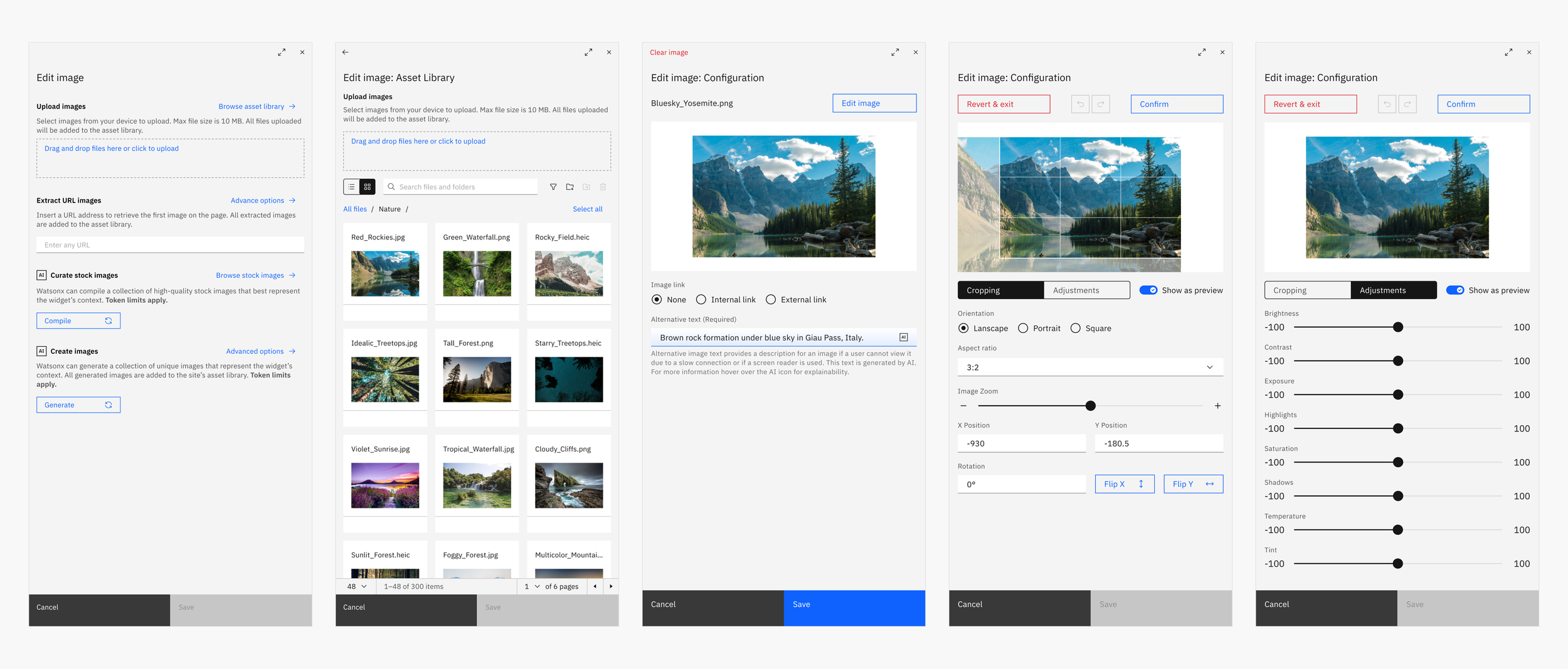
Keyframes from the redesigned widget: launchpad entry point, asset library, base configuration, cropping edits and color adjustment edits.
Impact
~2 (2.4) point
increase to Publisher’s NPS during the first post-launch quarter.
91.6%
task completion across workflows during the first post-launch quarter.
5 seconds
average time when uploading an image during the first post-launch quarter.
*Together, these results indicate improvements in both perceived product quality and the efficiency of core image-management workflows.
Challenges & trade-offs
Carbon consistency vs. familiar workflows
When Carbon lacked coverage for a workflow, I looked for existing components that could be adapted rather than introducing entirely custom patterns. Because these exceptions required Carbon team review and could affect our roadmap, they had to be intentional and sparingly used. The image card was a necessary exception because Carbon's tile component couldn't support the functionality required to maintain parity with Publisher's existing experience, while other deviations, such as adapting the drawer into a split-panel experience, were justified by significant usability improvements.
Immediate impact vs. long-term investment
Time constraints required us to break larger improvements into the smallest deliverables that could independently address meaningful parts of the problem, then prioritize them by impact. Stock image sourcing, for example, provided an immediate improvement for non-technical users, while an AI-assisted workflow using Watsonx could eventually evaluate page context and recommend more relevant assets. Because the latter required significantly more investment, we prioritized the stock library as an interim solution while deferring AI-assisted curation.
Simplicity vs. discoverability
Removing friction sometimes meant deprioritizing lower-frequency controls or moving them to secondary locations, trading some discoverability for a simpler experience. After adding additional sourcing options, I found that exposing every action upfront created unnecessary complexity, so I designed a launchpad around the most common actions for each source while keeping niche tools accessible elsewhere. I applied the same principle to the editing tools and image cards.
Before and after redesigning image settings into a split-panel layout, making it possible to adjust and preview changes while accessing editing tools.
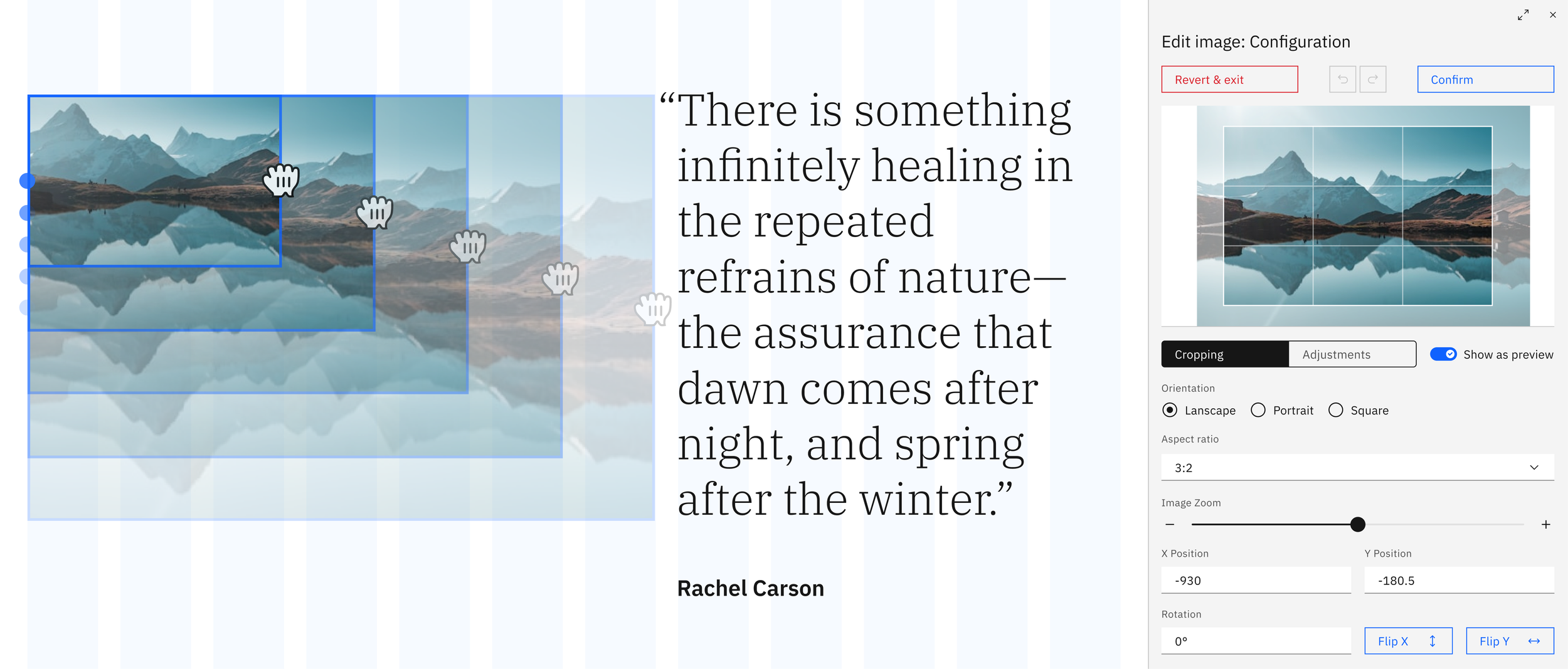
Images could now be edited (resized, cropped and color adjusted) in tandem with immediate feedback, reducing excessive re-entry.
Before and after introducing micro-interactions that made common image editing tasks faster and more intuitive.
AI-assisted enhancement that curates relevant stock images based on page content, reducing the time users spend searching in image libraries.
The introduction of maximizing panels expanded the user workspace for more detailed image editing.