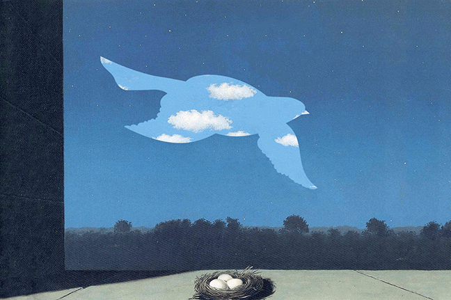
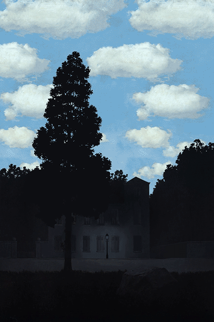
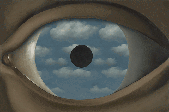
From Moment to Movement
In his later years, the painter René Magritte explored film and photography, suggesting he may have embraced modern technology with similar curiosity. Here, I imagine what that would look like by adding movement to his paintings.
These are motion graphics I created from paintings by René François Ghislain Magritte. I do not claim the paintings as my original art.
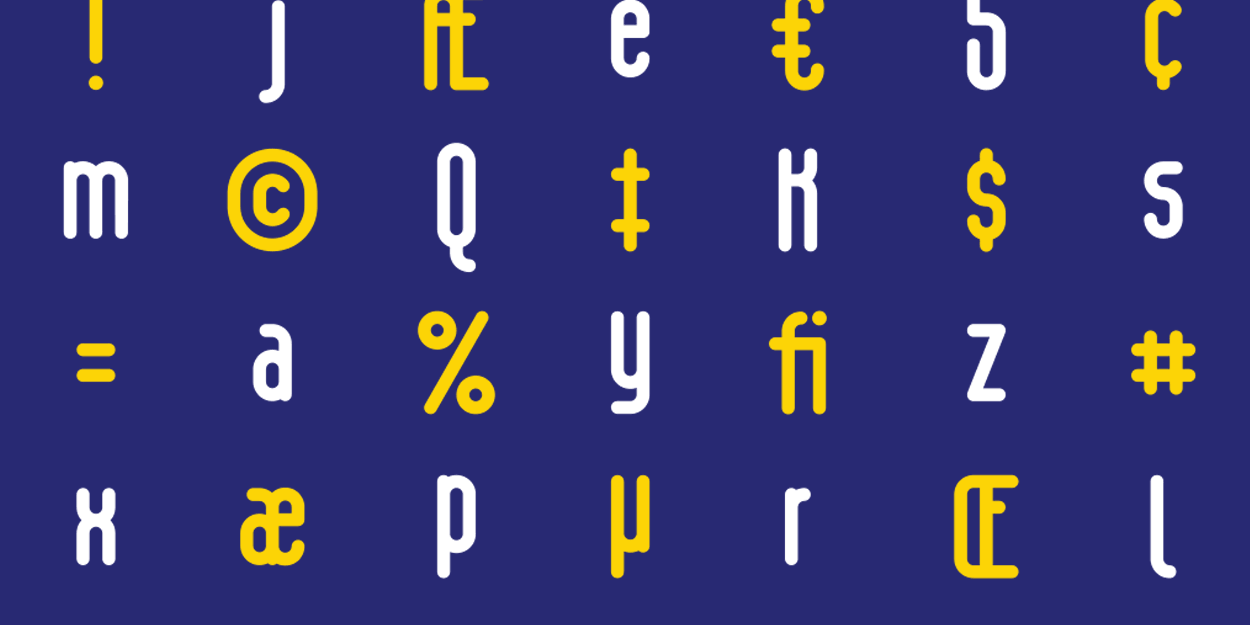
I discovered this font while sketching logotypes for a restaurant. I couldn’t shake the quirky charm of the letters. While extracting the letters and borrowing shapes to create the font family, I kept thought about the story of Adam and Eve. While the gendered notion of women being created from men is regressive, the idea of taking what exists and putting a unique twist on it resonated with me.
I combined this idea of supplementation with modern colloquialism to create Ribrun. The name exemplifies the idea it stands for. Eventually, I want to include found materials and other multimedia in every font specimen to create a continuous narrative.
Conceptual branding for The Crooked Knife.
The Issue
Due to stagnant wages and expanding rent gaps, community displacement is an inevitability for many low-income families. Branding or rebranding a neighborhood is typically associated with aiding in this process. But does that have to be the case?
The Fix
My concept was a resource department that also functioned as the Flatbush brand. A facility that puts an emphasis on internal growth instead of relying on a facade to seduce more affluent buyers and renters. It would be a catalyst for Flatbush pride and contribute to education, entrepreneurship and micro investment opportunities.
The Logo
My inspiration for the logo was the road system. All lines connect into an island-like structure, creating a sense communalism. Lastly, I chose the road system because of it’s longevity; while commercial businesses change, the road system remains connected and enduring. Flatbush’s goal is to inspire and facilitate this same resolve in the community.
The Truman Show is my, all time, favorite film and one of the largest art influences of my youth. Peter Weir’s film is about Truman Burbank whose life is—unknowingly—a 24/7 live broadcast and the most watched show on television.
In my illustration, I communicated three themes from the film:
• Corporate Orchestration with directional forms.
• Truman’s Isolation by utilizing negative space and color.
• Fabrication by creasing the backdrop and not adding volume to the clouds.
Topshop concept campaign for the “Going Out” sale on Party Essentials.
I am responsible for the photo editing, layout and design. The copy is Fashion Ipsum and the images are provided by TOPSHOP.
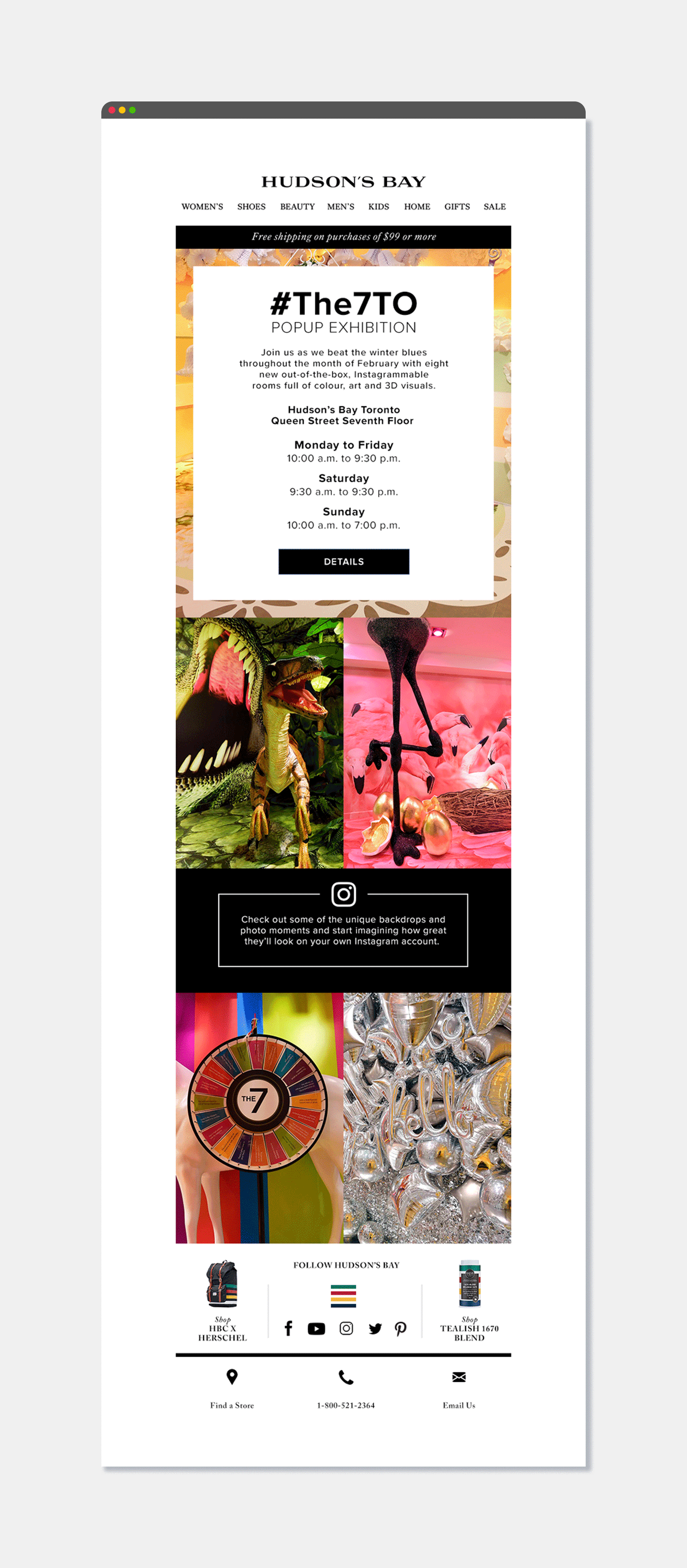
Hudson’s Bay digital marketing campaign request.
I am responsible for the photo manipulation, layout and design. The images are provided by Hudson’s Bay Company.
The Problem
The Hudson’s Bay Queen Street location dropped in store sales due to inclement winter weather. As a result, HBC hosted an immersive installation on the 7th floor to drive in-store traffic. Unfortunately, the sponsored social media ads promoting the event didn’t create the desired metrics which prompted them to reach out to my team.
The Solution
Create digital assets highlighting the social benefit of the event, prompting social media interaction and subsequently more in-store purchases.
The Result
There were over 3000 social media impressions using #the7to, including several social media influencers. Subsequently, the campaign successfully increased in-store foot traffic and sales, fulfilling the brief.